
What’s Different About the Blue Jays’ New All-Red Uniforms, Anyway?
At first glance, the Toronto Blue Jays’ new all-red “Canadiana” uniforms look very similar to last years’. For the most part, they are. But there are subtle differences between the current and previous versions of the the Jays’ alternate reds.
First off, for a team called the “Blue Jays”, there isn’t a single stitch of blue on the new alternate uniforms. Normally, I’d say a team is abandoning its identity here, but the Blue Jays are simply capitalizing on being “Canada’s team” by de-emphasising the blue and emphasising the red.
I actually like the cohesive red & white look to the uniforms. Previous iterations looked a little too disorganized to me with the red and the blues of the logo (combined with the typical blue three-quarter sleeve shirts).
ADVERTISEMENT
Anyway, here’s a look at the small changes to the Toronto Blue Jays new-ish alternate red uniforms for the 2017 season.
New – All Red Blue Jays Logo, No White Piping

Gone is the white piping from the uniforms, and instead is just a solid monochromatic red across the entire uniform. For whatever reason, the white piping on the uniforms last year didn’t look very clean; this year’s iteration of the jersey does.
The Blue Jay logo itself is also just the red and white combination, as opposed to the ordinary dual-blue and red leaf logo.
New – Red Stripes and Cleats
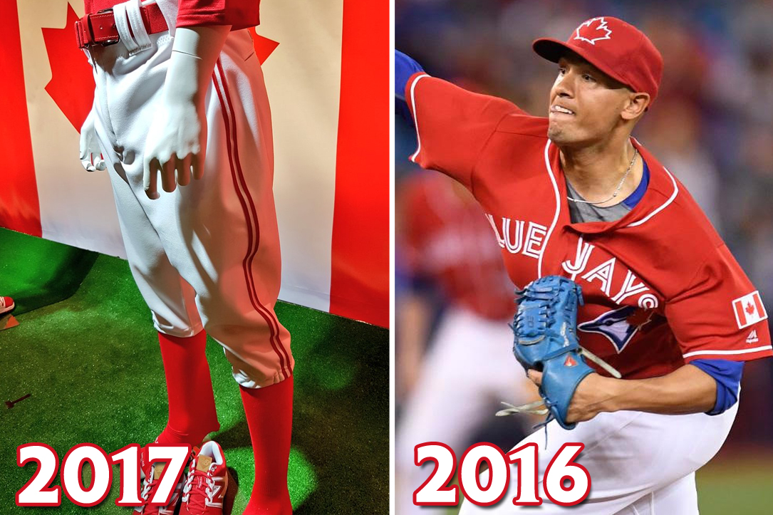
The changes were made in the lower half of the uniform as well; instead of the plain white pants, now there’s a dual stripe down the sides of the legs. All-red cleats will also accompany this uniform for every Sunday home game.
New – Red Maple Leaf Patch

One other notable difference; instead of a Canadian flag patch on the left arm, it’s been replaced with the red maple leaf logo. This is the very same maple leaf which is featured on the cap.
ADVERTISEMENT
NEW – Stitched and Raised Maple Leaf on Cap

And @Minor_Leaguer noticed the primary leaf logo on the cap is slightly different than last year. Instead of the flat logo, it’s an actual rasied switched red maple leaf this year.


