
Acid Flashback Friday: The T-Bird

It’s been a bitter of a Debbie Downer week as far as Blue Jays news, so I figured it was time take a break from all the doom and gloom with a new feature called “Acid Flashback Friday”.
It’s where we can all trip together and relive some of the glory days from Jays yesteryear. Each week, I’ll try to dig up something from the Blue Jays time capsule and do a brief commentary on it. If you have any suggestions by the way, please send them to bluejayhunter@gmail.com.
On the inaugural edition of Acid Flashback Friday, we examine the infamous “T-Bird” logo or what appears to be a combination of BJ Birdie and Ace jacked on steroids. The logo was very short-lived thankfully, as an alternate logo from 2000-2002 and the primary logo during the 2003 season.
ADVERTISEMENT

First of all, let’s address the token symbol of the true north strong and free, the red maple leaf which is “tattooed” on the blue jay’s arm. Strangely, there isn’t even a stem on the leaf – it’s like the bird was out getting the maple leaf tattoo and then the tattoo artist suddenly realized he didn’t have enough ink to to finish the leaf. I guess that must have been a precursor to the J.P. Ricciardi cost-cutting measures.
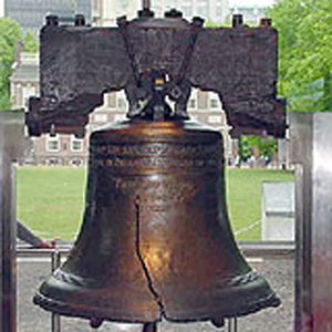
Next, what is up with that pathetic excuse for a “T” in the background? The mishmash of colours isn’t very appealing to the eye, and it sticks out like a sore thumb … which may have actually been the intention all along. And I’m not exactly sure why, but for some reason the shape of it reminds me of the Liberty Bell.
Finally, let’s discuss the logo in its entirety. It looks like what might happen if the Disney Corporation purchased the team instead of Rogers Communications. In the early 2000’s, for some reason or another, teams thought it was necessary to put cartoons in their logo. As the Blue Jays quickly learned, this was a very bad idea and scrapped the logo entirely by the 2003 season.
Thankfully, fans won’t see the “T-Bird” on a featurette of Hinterland Who’s Who any time soon because that species is extinct and should never ever come back to life.


If there is any decency left in the world we will never see those terrible uniforms again
I certainly hope so! That was a dark, dark time in Blue Jays logo history that I hope to one day forget.
I agree, this was pretty lame and it hurts the eyes to look at more than a couple seconds.
Chris, if your eyes start to hurt after looking at the T-Bird, just scroll up and look at the trippy Acid Flashback Fridays picture. It's like an acid trip for the eyes!
What comes around goes around. At some point in the future those 'retro' unis will make an appearance and probably be popular. Nobody liked the original Jays logo at the time and now I see everybody with a Jays hat wearing that original logo in Toronto. Hopefully I'm very wrong…
Yeah, there was not a lot of love for the funky 2-line numbers on the old unis, but as a retro they too seem strangely appealing. I have a hard time thinking that the T-bird will ever seem appealing, but … shit happens.
Mattt, QJays, you guys are probably right – give it another 10-15 years and people will be enthralled with these jerseys once again. But I for one hope that day never comes!
You're bang on with this post. I hated the T-Bird. The logo was so ugly and the jerseys were equally as ugly. I own 8 Jays caps but will never ever buy a T-Bird one!
HLF, the jersey should be abolished and stricken from the record.
Not even Roy Halladay could make the T-Bird jerseys look good.